How to use Pandoc to create computational notebooks that include print-quality vector charts
Today I learnt …
If you want to use Pandoc to create computational notebooks — just like Observable, RMarkdown, and Jupyter Notebooks — you can: the pandoc-plot filter lets you generate charts from Markdown code blocks. That means that a code block like this:
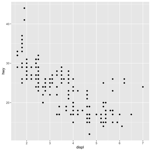
Will be executed as R code and replaced with this chart:
But there were two problems I needed to solve before I was truly satisfied with pandoc-plot: first, it renders figures as PNG images by default; and second, you can’t control the height and width of the figure.
PNGs are no use if you want to produce a print-quality PDF. You really want a vector graphic. This can be solved by telling pandoc-plot what format you want the figure to be. The first line of the code block becomes this:
This leaves us the second problem: how do we set the size of the figure? If we do nothing, figures are square, which isn’t a good shape for many charts. This solution is specific to R code blocks, but we can create a new SVG graphic device and set the size (in inches). Adding this line to the R code block gives us a vector figure eight inches by five inches (roughly 20cm by 13cm):

Now we have a vector figure with a height and width within our control, with just a few lines of code:
With this, you can write computational notebooks in Markdown and use Pandoc (via LaTeX) to generate print-quality PDFs.