ggplot2
The 6 pages that I, in my great wisdom, have decided have something to do with ‘ggplot2’. Whatever that is
-
How to use Pandoc to create computational notebooks that include print-quality vector charts
Today I learnt …
-
How do Covid cases in Iceland compare to Britain?
Data
Looking at the seven-day rolling rate of new cases per 100,000 population in Iceland and the United Kingdom

-
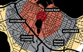
What if it were our city?
Maps
What impact would the Fat Man atomic bomb, dropped on Nagasaki in 1945, have on modern-day Reykjavík?
-
Which planet is closest to Earth?
Visualisations
The BBC’s Sky at Night programme said our nearest neighbour is Mars but one viewer disagreed. Was he right? Let’s find the answer using Python and R

-
The rise and fall in support for British political parties
Visualisations
How the distribution of the popular vote has been shared between Britain’s main political parties since the 1950s

-
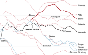
How Antonin Scalia compared with other Supreme Court justices
Visualisations
Charting the swing vote in the US Supreme Court, and finding a flaw in the New York Times while we’re at it