The world in recession
Blog
Visualising which countries are in recession, and which aren’t
If you’re a nerd and you haven’t heard of The Guardian’s Datablog, you should feel embarrassed. Each day Guardian journalists work with datasets — checking the facts and finding credible sources — and since March, instead of them sitting lost on a hard disk somewhere they now publish them on the web — on the Datablog in fact.
Not only do they make the data publicly and freely available, they also urge you to do interesting things with them. A recent blog post offered up information on which countries are in recession, and which aren’t, and so I thought I’d have a crack at visualising the data. The data doesn’t cover every country, but it does include nine of the ten largest economies (Russia is missing) and a host of smaller European countries.
So, for starters, a map of the world. Countries coloured green are those that have either not been affected by the current recession or are just out of it. Countries coloured red are those in recession.
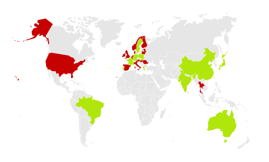
Countries in and out of recession; those in red are in recession, those in green not. See full-size image. Image based on an SVG from Wikimedia Commons and released under a Creative Commons attribution share-alike 3.0 licence.
That shows us that the recession is now largely confined to Europe and North America — indeed, the emerging economies seem to have weathered the storm pretty well, with China still seeing large growth.
I wondered whether the combined size of the economies not in recession was larger than those in recession. Using data from the International Monetary Fund on GDP by country I discovered it’s pretty close. The GDP for countries in recession is $24,735 billion and the GDP for those not in recession comes to $21,541 billion. Let’s make that easier to compare:
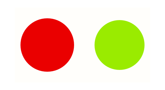
Comparative sizes of world economies; red are those in recession and green are those not.
Pretty close. But while I was making that chart I discovered that the US economy (the largest in the world) is bigger than the economies of Japan, China, and Germany (the next three largest) combined. In fact, if the US comes out of recession then the chart above would look like this:
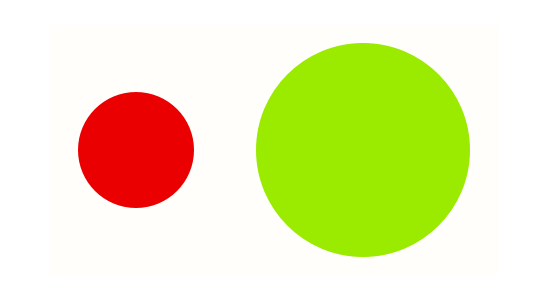
Comparative sizes of world economies if the US were not in recession; red are those in recession and green are those not.
So we should all keep our fingers crossed that the US comes out of recession. That in itself could well be enough to push every other economy in the world out of recession too.