Who came second in the British general election?
Maps
Britain’s voters are more diverse than the election results suggest
On Saturday Kieran Healy posted a map that had an interesting take on the recent British general election. It coloured every UK constituency according to the party that came second and so gave a much more variable hue to a country that, due to the first-past-the-post electoral system, tends towards homogeneity.
I thought I saw two areas of improvement though. First was that Kieran’s map is geographical, which means that Scotland’s 59 MPs are given more weight than London’s 74 because Scotland is almost 50 times larger than London. What’s needed is a cartogram, a map that shows each constituency at an even size. That way, each MP has the same relative importance.
The second improvement is to alter the map to make it more proportional. Currently, Kieran’s map has the same problem as first-past-the-post: whoever comes second ‘wins’ everything, and all other votes count for nothing. This means the second-placed candidate in Liverpool West Derby who received 8.5% of the vote is given the same prominence as the runner-up in Wirral West with 44.2%. To create a more proportional view I felt the strength of the colour used for a constituency should match the strength of the vote.
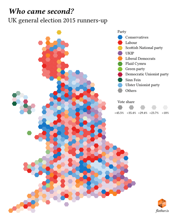
Proportional cartogram showing second-placed candidates for each constituency in the UK’s 2015 general election.
The underlying cartogram came from The Economist and the data is Kieran’s own. I put it together using a hodgepodge of Python and R.
There are a few things you notice that aren’t obvious in the second-past-the-post geographic map. The Conservatives put up strong opposition in west London but are much weaker runners-up in east London. Although UKIP came second in many constituencies their support in many is not strong. Likewise in the south of England, where Labour and the Liberal Democrats often come a distant second. And much has been made of the Liberal Democrats fall in support in their heartland in the south-west of England, but in many seats they put up a strong resistance. It’s possible that it’s not as large a slump as has been made out. No doubt much more could be garnered from a more in-depth study.
My map isn’t without its problems of course. By favouring constituencies over geography it’s harder to pinpoint where particular constituencies are and it would perhaps be better to include regional and national boundaries, or to make it an interactive map as with The Economist’s own cartogram. But that, as they say, is left to the interested reader.