The story of 2015’s Kexreið
Visualisations
Sixty riders jostle for position in a 30km criterium around Reykjavík’s city centre
Earlier this month I climbed onto my saddle and took part in Kexreið, my first real bike race. A small thing — 60 or so riders on 16 laps of a 1.9km course — but exhilarating nonetheless. A few days later, after the lap times had been published, I decided to play around with the race data.
Lap times were recorded by Þríþrautarfélag Kópavogs (Kópavogur Triathlon Club, nicknamed Þrikó) and published in tables that included each rider’s lap times and the final standings. The tables are fine if all you want to do is look at a rider’s lap times but it’s not easy to compare one rider to another, nor see the story of the race. So I chose instead to make a lap chart using R and ggplot2.
The lap chart shows a line for each rider, with each point on the line being the rider’s position at the end of that lap. (Something similar is often used in motor racing.) It lets you compare riders and see how a rider’s position improves (or deteriorates) over time. It gives you the story of the race as you see riders climb up the standings, fade towards the end, make that final rally. It lets you gauge how the race was won.
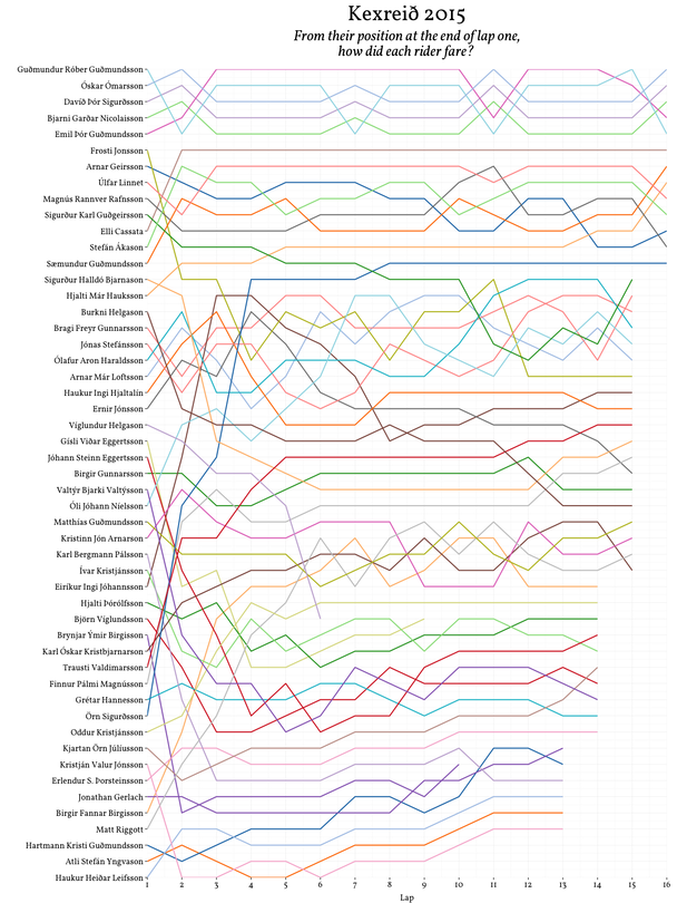
Lap chart for male riders in Kexreið 2015. The race was over 16 laps, but once the winner had finished then lapped riders stopped at the end of their current lap. Larger version
Roughly, from the chart you can see a select group of five or six riders who rode together at the front of the race, behind them another seven or so in a loose group, then the rest of the pack variously peaking too soon or building from the back, trading places throughout the race, and lastly a motley collection of lanternes rouges. The first group probably rode together, taking turns at the front, before the final sprint for the line was won by Óskar Ómarsson.
Unfortunately, the lap chart can only be an estimate of the race because of a lack of clarity in the published data. Add up the lap times for a rider and they can be as much as nine seconds out from the official finishing time. I think this is because lap times are given only down to the second with any fraction removed: if I finished a lap in 3:32.9, my lap was published as 3:32. This lack of precision also means that if two riders have the same lap time (or cumulative lap times) you can’t be certain which rider was ahead at that point. When this happened I had to make assumptions.
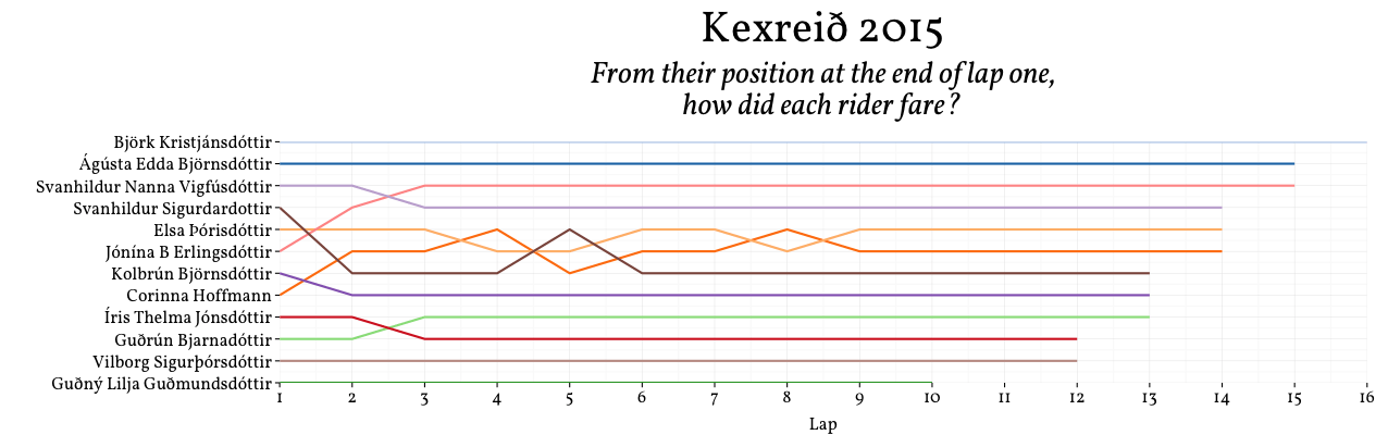
Furthermore, to my disappointment, even though men and women rode together women were listed in a separate table. Who knows if Björk Kristjánsdóttir beat the three men who finished at the same time as her? There’s no way to tell, so I had to leave the 12 female riders out. (I did make a separate lap chart for women but there were fewer riders and they swapped position less so it’s not as compelling.)
There were also no lap distances given (lap one was shorter than all the other laps) so you can’t calculate average speeds. And DNFs aren’t flagged, so you can’t differentiate between someone who crashed out on lap 13 and someone who finished on lap 13.
But minor data niggles aside, it was a thoroughly enjoyable race. If anyone of the organisers is reading this I’d love to see the data rectified for next year when I’ll be aiming to improve on my 31st place.