Já’s new map: switching from raster to vector
Maps
In a talk I gave to LÍSA, the Icelandic association for geographic information, I argue that we need to think about maps as software now
On the 11th of March LÍSA, the Icelandic association for geographic information, held its spring conference. (It was originally supposed to be an autumn conference back in 2020 but, you know, Covid.) I gave a twenty-minute talk on why and how we at Já launched our vector map of Iceland a year earlier. Here’s the transcript.
Hello everyone, thanks for inviting me to give this talk today.
My name’s Matt Riggott, I’m a programmer at Já working with maps and geospatial data. I’m also a part-time student at Lund University, working my way through a master’s degree in GIS.
The title of this talk is ‘Já’s new map: switching from raster to vector’, but that’s a little bit unexciting. So let’s add some excitement and say …
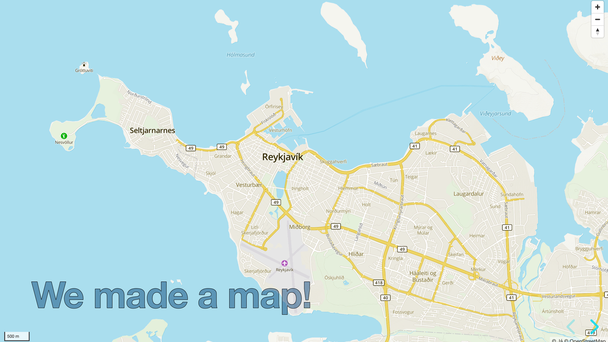
… we made our own map of Iceland! Making a map of such a large area at so many scales was a big undertaking, so I’m going to talk about why we did it, how we did it, and then demonstrate some of the advantages of our new map.
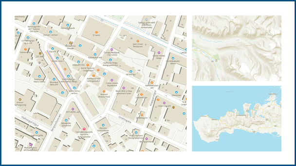
For anyone who hasn’t used it, Já’s map is a general-purpose web map of Iceland, supporting scales from national level down to street level. It’s designed for tasks such as looking up the location of a friend or a shop, getting directions between places, and planning hikes. It also has much more emphasis on the natural environment than most other web maps — for us, the mountains are as important as the roads.
Já has had a ‘slippy map’ on its website since 2009, produced from the beginning by Samsýn. In 2019 we decided that the map was so key to the company that we should build and control it ourselves. We launched our new vector map in February 2020.
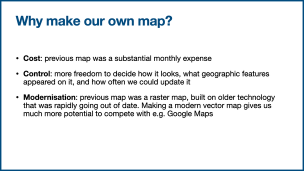
We decided to make our map for three main reasons: cost, control, and innovation.
- Cost. The previous map was a good, detailed map but it was costing us a substantial amount every month. We felt we had the expertise in house and that we could remove that cost
- Control. If we produced the map ourselves we would have much more freedom to decide how it looked, what geographic features appeared on it, and how often we could update it
- Innovation. The previous map was a raster map, built on technology that was rapidly going out of date and making it hard to compete with, say, Google Maps. Making a modern vector map gave us much more potential in the future
I’ve mentioned raster maps and vector maps a couple of times and it’s worth explaining what they are.
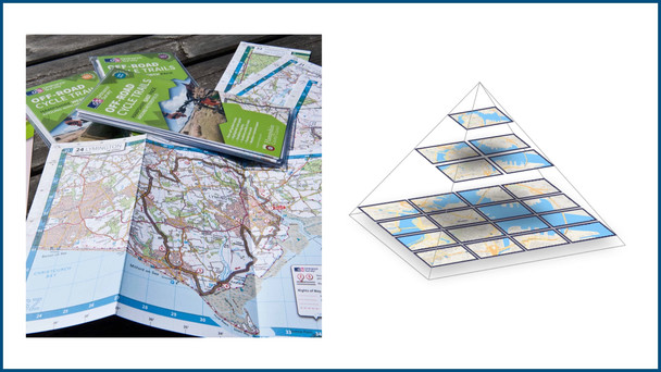
Raster web maps were invented in the mid-2000s. The original Google Maps was a raster map. They were the solution to the problem of how to get traditional paper maps onto a computer. Back when we used paper as our main medium for maps, a 1:50,000 scale map of Iceland was too big to hold in your hands. What you got instead were lots of smaller maps, the big map cut up into smaller, more manageable parts. You would get a map of only a particular city, or only a particular part of the country.
When we moved to using computer screens for maps, we did the same thing. A raster web map split the map of the world into square images, called tiles, each with fixed geographic area and scale. The tiles allow you to browse a small part of the country without loading the whole map, but as you pan and zoom around you have the illusion of exploring a single huge document. But it was just an illusion: the raster map was still a static, flat map, just like the paper maps that came before it.
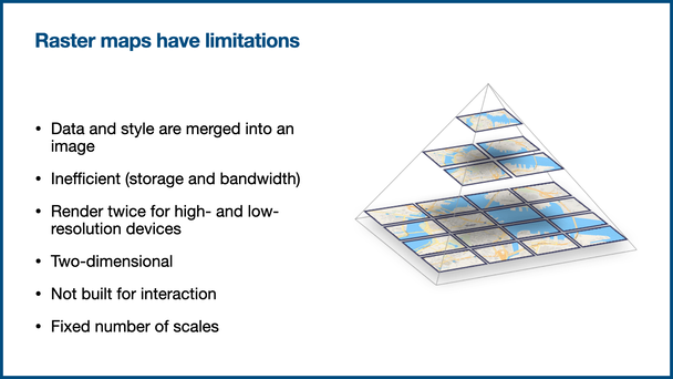
Raster maps were a fantastic technology for their time, but over time we’ve come to see that they have a few issues:
- The map features and the cartographic style are merged together in the tiles. You can’t change one without needing to change the other
- They’re inefficient. They take up a lot of storage space and it takes a long time to render the tiles — it can take days to render a map of Iceland
- You need to render everything twice if you want to support high-resolution devices like today’s smartphones
- They’re two-dimensional. You look at the map from a bird’s eye view: straight down and usually with north at the top
- They’re not interactive. They’re just flat images
- Only a set number of scales. Zooming in means going step-by-step in jerky movements. It’s not smooth
Vector tiles solved these problems for us.
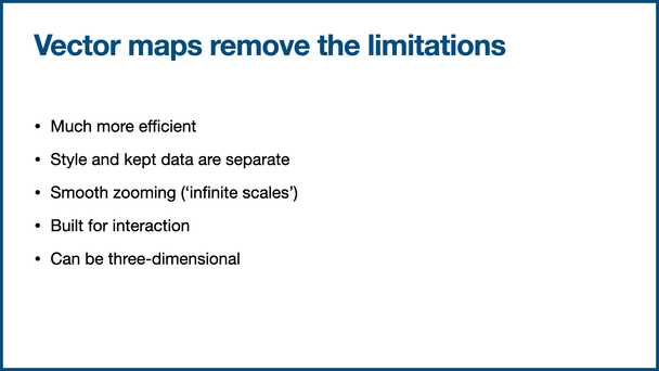
Like raster maps, a vector map is still made up of roughly square tiles. But the tiles are vector data, not raster images. A map’s style is completely separate. Together, the data and the style are passed to the client (browser), which is left to render the map in real-time. Vector maps are:
- Much more efficient. They use less storage space, they use less bandwidth, and they’re much faster to generate. We can generate our map of Iceland at multiple scales — roughly from 1:20m to 1:2,000 — in one day, and we should be able to reduce that time after further optimisations
- Zooming is smooth all the way down
- The style is split from the data. This means you can produce many different map styles from a single set of vector tiles
- They can include three-dimensional information
- They’re interactive
All in all, vector maps are much more flexible.
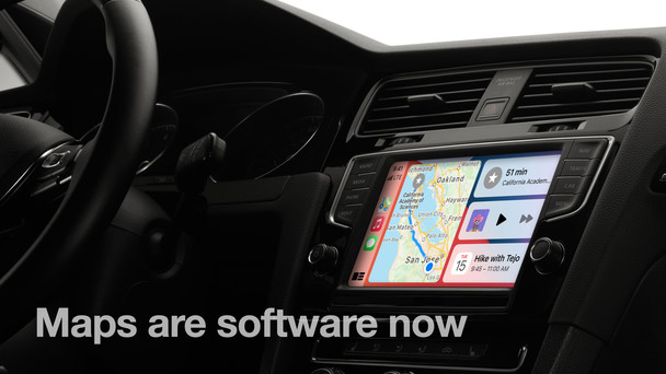
But the most important point is that maps are software now. At least from Já’s perspective we needed to stop thinking about maps as pictures and start thinking about them as software. They can appear on phones and in cars. People interact with them.
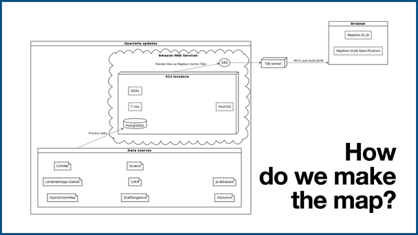
The diagram on this slide explains how we make our vector map, from start to finish. It’s not the way to make a vector map, it’s just how we make it.
Currently, we create a new version of the map every three months. It starts with the data sources in the bottom-left corner, and finishes with the web browser, in the top-right.
Every three months we take a snapshot of the data from our sources, process that data, and store it in a PostgreSQL database. That database is in Amazon’s cloud, on a powerful machine that we provision temporarily for about a day every three months. We use open-source software to render the tiles (T-rex currently, perhaps Tegola in the future), and then store them permanently on a server in Iceland.
Technically, the map is made up of two things:
- the vector data tiles, stored in a format called Mapbox Vector Tiles (MVT);
- and the cartographic style, stored in a JSON file.
To see the map, a browser makes a request to the server to get the data tiles and the style file, and renders the map in real-time.
Currently we render the map tiles at zooms 4 to 16 every three months, but in the future we want to take data snapshots much more frequently — perhaps weekly — and render them only when they’re needed by browsers. That would allow us to have a much more up-to-date map.
Now I’d like to spend the rest of my time on some demos, showing you the benefits of vector maps and what they’re capable of. [Ed: these demos were shown live in a browser during the talk, but here I’ve just included screen recordings.]
Switch styles. Here we have a vector map of Reykjavík. But because the data and the style are separate, we can have many different types of map without having to re-render the tiles. We can even filter out features we’re not interested in — for example we can remove parks, schools, and other land cover with the flip of a switch.
Hillshade. Because the data and the style are sent separately to the browser, the map can be dynamic and interactive. Here, I can use the sliders in the top-left corner to change the intensity of the hillshade, and even change the position of the sun.
Overlays and interactivity. When you want to add a data layer to a raster map, you can only add the new layer above everything else. If you want to show traffic congestion, for example, you would need to place it on top of the map’s labels. With a vector map, you can add a new layer anywhere in the stack of layers. On the Já map, we’ve added a layer to show traffic congestion. It’s added underneath the labels for neighbourhoods, towns, and so on. It doesn’t cover the label for Reykjavík.
Smooth zooming. With raster maps, moving between zoom levels is clunky — try zooming in and out on OpenStreetMap for example. A vector map allows you to move smoothly between zoom levels.
Pitch and yaw. Here’s a standard map view, top-down, north up. Two-dimensional. That’s how we’re used to seeing a map on paper, but it’s not suitable for every map. You don’t always want north up. You don’t always want it to be flat. Notice how the symbols are always facing you, so they remain easy-to-read.
Three-dimensional buildings. And we can take this further and add three dimensions to the map. Here’s part of Reykjavík city centre, close to the tall buildings along Sæbraut. A city isn’t flat, it’s three-dimensional. This is useful to let people get their bearings — for example, you might want to show people a street level view when giving them directions. This is a live map, rendered in three-dimensions in the browser.
Three-dimensional maps. And we can take this even further again. Because the map features and the cartographic style are separate, we can use them in different ways. The hillshade data can be used to make a 3D environment, and the vector data can be used as textures.
There’s much more we can do with web map software too, like combining satellite and terrain raster data to create three-dimensional environments. We’re only just starting to scratch the surface.
What I hope this talk and its demos show is that digital maps are interactive and dynamic software environments. We should stop thinking of them as two-dimensional images. Maps are software now. Once we think of them like that, we open up a whole new world of potential.
The maps shown during the talk are © OpenStreetMap contributors, © Já hf, and © Mapbox.