Github participation sparklines for Django
Blog
Introducing a library that lets you display snazzy charts on your Django-based web site
Everyone loves Github, don’t they? I know I do. It’s dragged me kicking and screaming into the world of distributed source control and, on a wider scale, it’s increased participation in open-source projects.
One of the great advantages Github has over similar sites is its clean, usable interface. A nice touch is the participation graphs you see for each user — you can see activity on the django-openid project for the last year on Simon Willison’s Github page, for example.
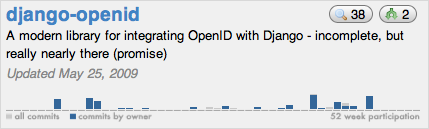
Github’s bar chart showing activity on Simon Willison’s django-openid project during the last year.
I want those graphs on my web site. I want to be able to show my activity on the code that powers this web site, and I want to show it right here on this web site. I want a Django template tag to do this for me. If you do too, you’re in luck: that’s exactly what my latest project, Participation Graphs, does.
Participation Graphs is a small Django app that provides one thing: a template tag, github_participation_graph, that outputs a sparkline showing a project’s activity for the last 52 weeks. For Rails it would look something like this:
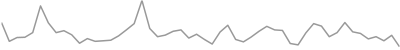
Activity on Ruby on Rails during the last year.
How does it work?
It turns out the participation data for every Github project is freely available, albeit in a rather cryptic form. Full details can be found in this Github guide, but it boils down to requesting a URL and getting back plain text containing two lines of data — one line for the number of commits per week and one line for the number of commits by the project owner. The commit data for Django looks like this (truncated for readability):
BnBUBIB5BuCyFIBTA8ASAPAtAPAGAdAaAeAzAQATA3ALAKAYAMARA […]
AAAAAAAJAAAMAWAAAAAAAAAAAAAAAEAGAAAAAAAAANAAAAALAAAAA […]
Each line is a string of characters, each pair of letters representing a week’s commits. AA is no commits, AB is one commit, BA is 64 commits, and so on. Once this data is converted to integers I can pass it through to Google Charts to output a lovely sparkline.
How can I use it?
Full details on installing the app can be found in the README, but put simply you should install the app onto your Python path and then include the following in your template:
{% load githubgraphs %} {% github_participation_graph "brosner" "django" %}
The template tag will output an img element like those above. There are two mandatory arguments and three optional arguments:
- Github username
- Github project name
- Image dimensions (defaults to
400x50) - Data colour as a hex-code without the preceding hash (defaults to
999999) - Image background colour as a hex-code without the preceding hash (defaults to
ffffff)
Help yourselves
So please, try it out. I’ve released it under the GPL v2. If you like it, leave a comment below or contact me. If you’d like to see extra functionality, raise an issue or fork the project.
Update, 23rd September 2010
You can now download this package from PyPI.